Tag: tutorial

  • From book scene to artwork: From words to an illustration

    From book scene to artwork: From words to an illustration

    Maybe you’re an author searching to hire the perfect illustrator, maybe you’re a visual artist or designer… or maybe you’re just curious about how some scenes are selected to be represented in a book. Why are some scenes more likely to leave an impression on the audience? Who decides what to draw? In an amazing book, how to choose the best scenes?

    Please know that I am sharing my process so different people might have a different way. However, I believe that choosing strong, impactful scenes to portray is somewhat a universal need for a successful representation of a book and trained illustrators can work closely with the author following these tips.

    I recently wanted to illustrate a scene from Tolkien’s The Fellowship of the Ring. I chose the Prancing Pony scene where Frodo is singing before he trips and the ring accidentally lands on his finger. I picked this scene because I felt an illustration could be a great companion to the song in the book.

    What’s the role of artwork in a book?

    Illustrations are not only going to make the book pretty, they offer so much more:

    • Combining illustrations and words will help create a memorable narrative experience
    • Illustrations not just follow the author’s words, they will also portray their personality and vision for the story
    • An illustration should augment the words, not duplicate them, providing the reader a new emotion, take, or frame of what they’re reading
    • Illustrations act like a bridge between the text and the reader, conveying emotions and feelings
    • Marketing assets

    How to choose the best scene from a book to illustrate?

    Of course being absolute on what “best” means can be troublesome, and as usual, it depends on the purpose of the illustration (clarify, foreshadow, deepen emotion, orient in space, etc.)

    But the best scene to illustrate is a moment that is pivotal in the story, visually clear, and emotionally charged enough that an image can carry it without the surrounding paragraphs.​ Let’s emphasize that “pivotal” does not always mean the big twist; it can be a quiet turning point, first reveal of a setting, or a character choice that changes everything.​

    Before choosing the best scene(s), map the whole story. Authors can work with the illustrator and list key beats: inciting incident, turning points, climax, resolution, plus any especially vivid descriptions.​

    From that list, mark which beats actually need visual help (complex setting, abstract idea, large cast, or emotional nuance hard to explain in words alone).

    Look for big turning points, emotional highs/lows, and important character introductions.​ In children’s books in particular, scenes that establish setting, mood, or recurring motifs make strong illustration anchors across the book.

    Avoid cool but empty images

    Prioritize scenes that move the story forward, reveal character, or set up/follow through on conflict, not just random action for spectacle. Of course, sometimes a scene can be so emotionally charged or set the mood and theme. These are great scenes for a visual worldbuilding.

    Strong scenes often serve multiple purposes: plot beat + character development + setting details or symbolism packed into one moment.

    Use illustrations to establish mood and theme

    We can also think beyond what’s written and think about abstract concepts, symbols, and embrace creativity. Pick scenes that capture the essence of the book’s tone (whimsical, funny, intimate, etc) so the illustration reinforces a theme.​

    Mood can be expressed visually through color, lighting, and composition choices (e.g., warm vs cold palettes, crowded vs empty spaces).

    Thinking beyond literal illustration encourages visual storytelling that complements and enriches the written narrative by creatively expressing ideas, feelings, and themes in ways that resonate uniquely with the viewer.

    I wanted to show a warm and cozy scene before things turn pretty dark. They were having fun, felt hopeful, and in a way they didn’t understand the seriousness of the task they were part of.

    Illustrations for subtext

    Borrowed from children’s book practice, in-between moments create a dynamic between words and images, known as word–image synergy. Instead of duplicating the text, these illustrations add subtext and emotional layers, inviting the reader to engage more deeply by interpreting what’s suggested but not explicitly shown. This could be a subtle facial expression, a symbolic object, or the atmosphere surrounding the action that hints at the unspoken feelings or future events.

    This technique helps transform a book from straightforward narration to a visually engaging, interpretive work where the pictures and text work together to tell a richer story.

    Final Thoughts

    Choosing scenes is less about “which parts look coolest” and more about co‑authoring the reading experience: deciding where an image will most powerfully shift how the reader feels, imagines, or understands the story.

    I am extremely happy with this one. BUT if I were to illustrate the whole book, I would need to do a list of scenes that are key beats or commit to a lot of illustrations. That’s not something I’m willingly embarking into at this time LOL!
  • How to paint a digital portrait

    How to paint a digital portrait

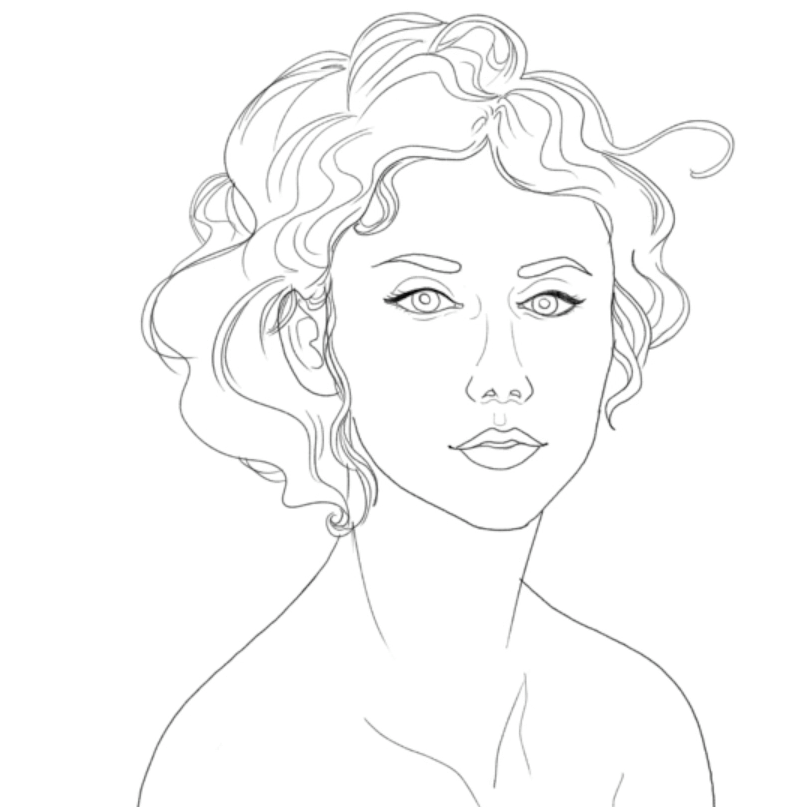
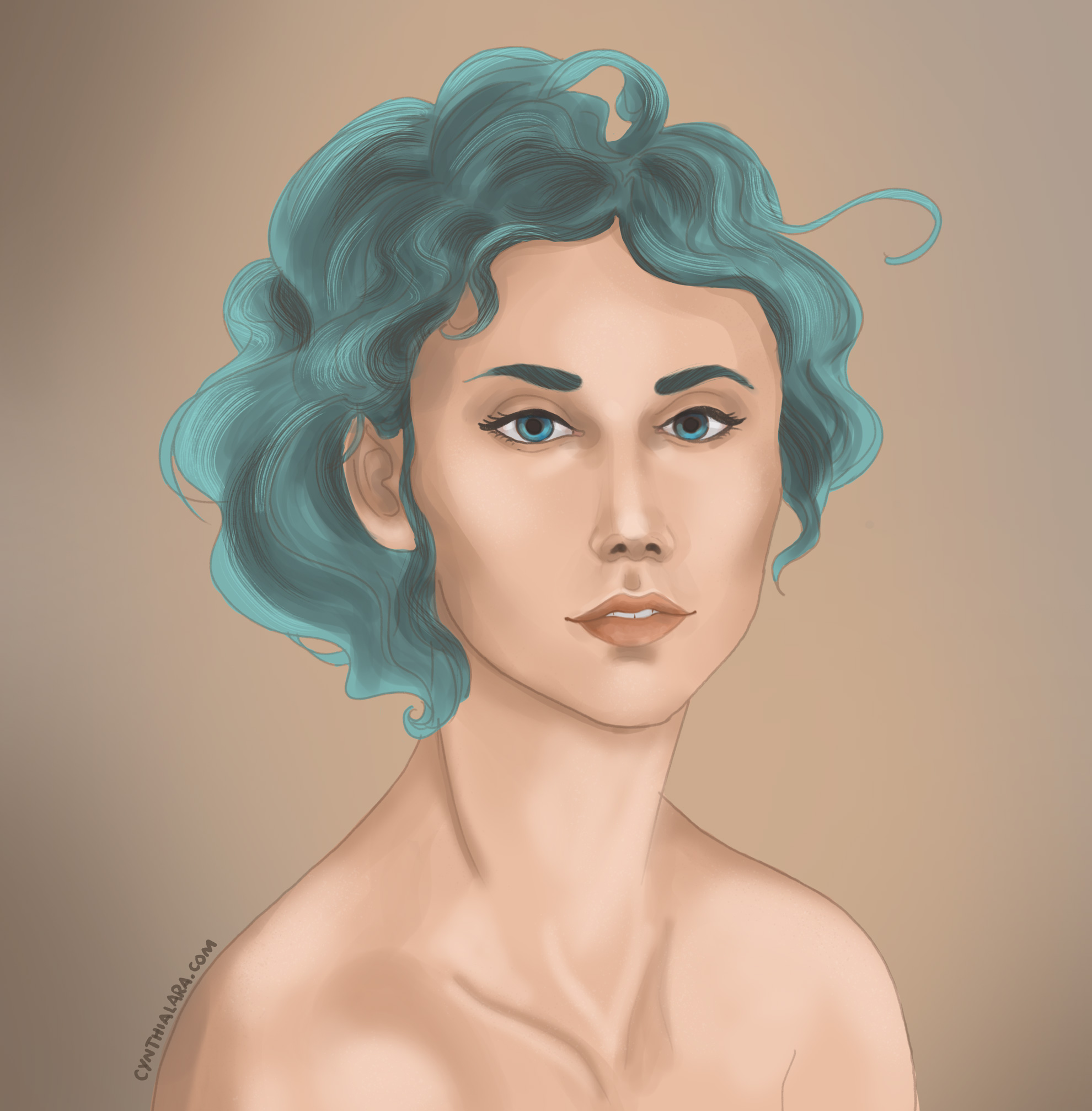
    Follow my process in this tutorial for a female portrait in Photoshop! There are probably a lot of other tutorials from experienced teachers out there but I guarantee fun times ahead!

    I will start by saying I am in no way a pro and I am a self-taught artist. So as you can see in my video, I do some ugly sketching, then follow it (kinda) and once the fundamentals are there, I add a little color, etc. I will go over my process in written form here as the video has no voice or steps.

    While this is a simple tutorial, my goal for you is not to copy exactly what I do in terms of the image or style, but to find a workflow that works for you. This workflow helps me be quick without the need to figure out what steps I should follow. For more on this, join the Paintable community for free. They do a lot of challenges and activities where you can learn workflows, but if you want to get serious, they also have some paid courses/masterclasses. This isn’t sponsored by them nor I have anything to do with them, but the workflow here is what I’ve learned through them 🙂 Another option is Marc Brunet‘s artschool program (one I invested in and am currently using to get better).

    This is something I did while streaming on Twitch in 2020 (yes, that year was pretty good for art– I was streaming for 2x week and doing a ton of things!) I didn’t record a lot of my streams but a couple became Youtube videos.

    Digital Portrait Tutorial

    The workflow goes like this:

    1. Sketch

      While I didn’t use a reference image here, I encourage you to do so. It is easier when you have something to compare your art to. Start with shapes and guides– I went straight to anatomic shapes but having circles and boxes instead also works as a first step.
      In fact, mine isn’t 100% anatomically correct. But finished, not perfect is better than not doing anything at all!

    2. Base Colors

      Use the midtone as base color. Don’t go too dark or too light on this one. We will build up from here.

    3. Shadows

      Take a darker tone for shadows and use a combination of brushes with soft edges and hard edges. Hard edges help build shape while soft edges help blend or create smooth surfaces.
      In this and the next step, a reference photo will absolutely make a difference. Shadow and light can be tricky!

    4. Lights

      Similar to the previous step but this time on the opposite direction. We want to paint the spots where the light is touching the portrait. Most of the time I start adding some rough details here, including changing the lineart color to be softer/closer to the tones I’m using in the overall piece. Of course you can always cover the lineart too for a more realistic look.

    5. Details

      I didn’t add a lot of details here, but in this step you can add texture, freckles, imperfections, extra highlights, stylized finishes, etc. If you’re copying from a reference and they have jewelry, for example, this is the step to literally shine!

    The video above is a simple portrait with no reference, but of course, when you do use reference, guessing is replaced by accuracy, as you can see on the other portrait where I followed the same steps as described.

    If you’re interested in seeing the process for my Thranduil portrait, we’re following the same steps. Please excuse me because I am chaotic, so I jump from one step to another as I find things I’m not happy about. However, I admit I haven’t been doing this for a long time… the more you stick to a workflow, the better you will follow it and be efficient with it.

    Final Thoughts

    I hope this tutorial is helpful for your digital painting journey. I think that finding a workflow is half the battle, and I am thankful that we live in this era of information where tutorials, step by steps, videos and incredible teaching/learning materials are available at no cost or at a fraction of formal education. Art should be accessible for everyone to practice!

    Follow this workflow and practice– I bet you can create a wonderful digital portrait by the third time you try!