Follow my process in this tutorial for a female portrait in Photoshop! There are probably a lot of other tutorials from experienced teachers out there but I guarantee fun times ahead!
I will start by saying I am in no way a pro and I am a self-taught artist. So as you can see in my video, I do some ugly sketching, then follow it (kinda) and once the fundamentals are there, I add a little color, etc. I will go over my process in written form here as the video has no voice or steps.
While this is a simple tutorial, my goal for you is not to copy exactly what I do in terms of the image or style, but to find a workflow that works for you. This workflow helps me be quick without the need to figure out what steps I should follow. For more on this, join the Paintable community for free. They do a lot of challenges and activities where you can learn workflows, but if you want to get serious, they also have some paid courses/masterclasses. This isn’t sponsored by them nor I have anything to do with them, but the workflow here is what I’ve learned through them 🙂 Another option is Marc Brunet‘s artschool program (one I invested in and am currently using to get better).
This is something I did while streaming on Twitch in 2020 (yes, that year was pretty good for art– I was streaming for 2x week and doing a ton of things!) I didn’t record a lot of my streams but a couple became Youtube videos.
Digital Portrait Tutorial
The workflow goes like this:
- Sketch
While I didn’t use a reference image here, I encourage you to do so. It is easier when you have something to compare your art to. Start with shapes and guides– I went straight to anatomic shapes but having circles and boxes instead also works as a first step.
In fact, mine isn’t 100% anatomically correct. But finished, not perfect is better than not doing anything at all!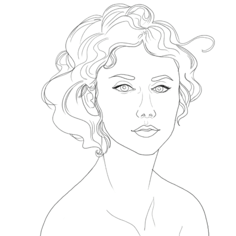
- Base Colors
Use the midtone as base color. Don’t go too dark or too light on this one. We will build up from here.

- Shadows
Take a darker tone for shadows and use a combination of brushes with soft edges and hard edges. Hard edges help build shape while soft edges help blend or create smooth surfaces.
In this and the next step, a reference photo will absolutely make a difference. Shadow and light can be tricky!
- Lights
Similar to the previous step but this time on the opposite direction. We want to paint the spots where the light is touching the portrait. Most of the time I start adding some rough details here, including changing the lineart color to be softer/closer to the tones I’m using in the overall piece. Of course you can always cover the lineart too for a more realistic look.

- Details
I didn’t add a lot of details here, but in this step you can add texture, freckles, imperfections, extra highlights, stylized finishes, etc. If you’re copying from a reference and they have jewelry, for example, this is the step to literally shine!


The video above is a simple portrait with no reference, but of course, when you do use reference, guessing is replaced by accuracy, as you can see on the other portrait where I followed the same steps as described.


If you’re interested in seeing the process for my Thranduil portrait, we’re following the same steps. Please excuse me because I am chaotic, so I jump from one step to another as I find things I’m not happy about. However, I admit I haven’t been doing this for a long time… the more you stick to a workflow, the better you will follow it and be efficient with it.
Final Thoughts
I hope this tutorial is helpful for your digital painting journey. I think that finding a workflow is half the battle, and I am thankful that we live in this era of information where tutorials, step by steps, videos and incredible teaching/learning materials are available at no cost or at a fraction of formal education. Art should be accessible for everyone to practice!
Follow this workflow and practice– I bet you can create a wonderful digital portrait by the third time you try!